

Overview
Kalpa is a professional development management platform used by K-12 school districts across the country. Built in 2001 as a Visual Basic desktop application, it had spent two decades accumulating features without strategy, and it showed. No information architecture, no design system, inconsistent UI, broken user flows, and a user base that had grown frustrated enough to consider leaving.
When Cynerge acquired Kalpa, I came on as the sole UX designer with a clear mandate: modernize the product and ship a version worth keeping.
Over three years, I led everything from research and IA to wireframing, prototyping, design system architecture, developer collaboration, and testing. The result was Kalpa V4, the first modern SaaS version of the product.

Research
With no prior UX documentation to work from, I started from scratch. I conducted user interviews with district administrators across multiple school systems, focusing on how they actually used the product, where they got stuck, and what compliance requirements varied by state. I also ran contextual inquiries, where users shared their screens and narrated their experience in real time, which surfaced pain points no survey would have caught.

To round out the picture, I led a cross-functional competitor analysis in Miro, bringing in perspectives from design, development, sales, and leadership to build a genuinely robust view of where Kalpa stood in the market and where the gaps were.
The research confirmed what the product’s history suggested: this wasn’t a UI problem. It was a structural one.
Define
I synthesized research through affinity mapping, organizing pain points from interviews, contextual inquiries, and the UI audit into themes that the whole team could act on. I also ran a heuristic evaluation against NN/g’s 10 usability principles, which gave us a documented, severity-rated foundation for prioritization.

Four personas emerged from the research: two administrative users (Nancy and Stan) and two teacher-facing users (Trish and Charles). The needs of administrative and non-administrative staff were different enough that combining them would have scattered our focus. For V4, we concentrated on Nancy and Stan, the users Kalpa was actually sold to, and kept teacher needs documented for post-MVP development.

The problem statement that came out of this phase: Kalpa’s legacy codebase results in poor performance and frequent bugs, hindering our ability to deliver a stable and efficient experience. Modernizing the codebase in conjunction with the interface is essential to reduce technical and design debt and ensure a reliable user experience.
Ideate
I introduced journey mapping to the team as our primary requirements-gathering method, replacing the fragmented, stakeholder-driven process that had been creating misalignment for years. Journey mapping brought the whole cross-functional team into a shared understanding of user goals before a single screen was designed.
We used three mapping formats depending on the problem at hand. Perspective grids helped catalog and analyze customer service issues. Experience maps gave us a high-level view of a user’s context across an entire feature or workflow. Customer journey maps went deeper, capturing emotions at each interaction point and surfacing opportunities that informed our technical requirements.

From there, I sketched and wireframed key flows, iterating through multiple versions before anything went to high-fidelity. The User PD Plan page alone went through several rounds of wireframes before we were confident in the structure.

Prototype
Prototyping for Kalpa wasn’t about creating a single clickable demo. The product has dozens of features, each with its own set of user flows, so I organized prototypes by user story, linked to corresponding Jira tickets, and maintained a story index in Figma so the team could navigate the work without getting lost.
The design system came together in full during this phase, built on Atomic Design principles: atoms establishing the visual foundation, molecules combining them into functional units, organisms forming distinct interface sections, templates defining page-level structure, and pages filling everything with real representative content.


The system gave developers a shared language, reduced edge-case confusion, and made the hand-off process significantly more predictable than anything the team had worked with before.
Test
I incorporated Maze into the design workflow to validate flows with real users before anything went into development. Each test included task-based scenarios aligned to real user goals, success metrics like completion rate and misclick rate, heatmaps and click paths, and follow-up questions to capture reasoning and sentiment.

The impact was concrete. Maze gave me evidence, not opinions, for design decisions. It reduced rework by catching flawed assumptions before they became built features. Developers appreciated having tested, clearly documented flows before starting work. And when features consistently passed testing, the team had genuine confidence going into development sprints, which mattered a lot for a team working in a legacy system under pressure.
It also created a culture shift. Introducing user testing in real time moved the team away from building based on internal assumptions and toward an evidence-driven practice.

Outcome
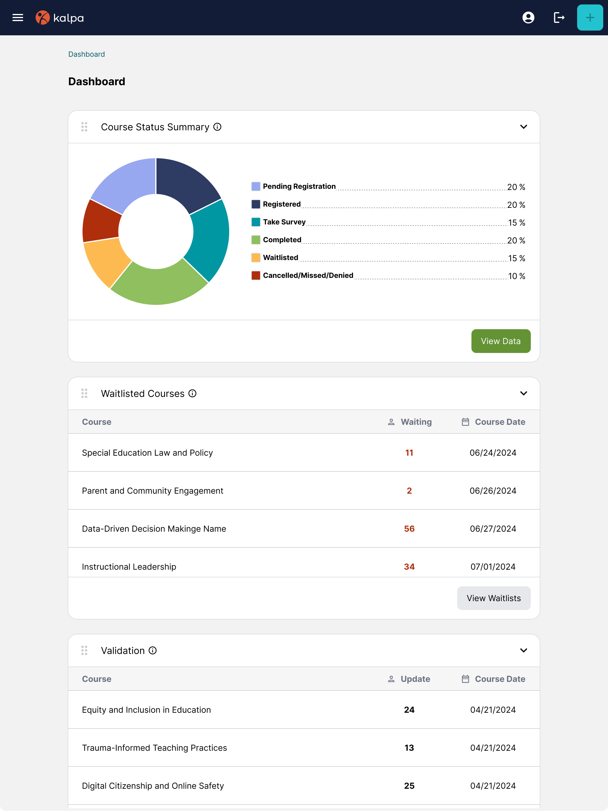
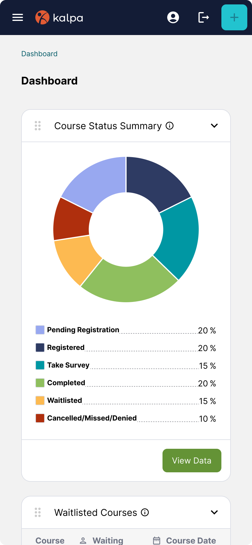
Kalpa V4 launched in summer 2025. As an MVP, there was still plenty to build, but the foundation was solid: a modernized interface, a scalable design system, clearer requirements, and a shared language the whole team could work from.
The most meaningful result wasn’t a metric. Early in the redesign, several long-term districts had expressed serious frustration with the legacy product. Rather than losing them, we invited them into the design process. Their feedback shaped our solutions directly, and that involvement turned frustrated clients into advocates for the new system.

Kalpa is the project that ultimately led me to Object-Oriented UX. I didn’t formally discover OOUX until after my time on the project ended, but looking back, it would have given the team a shared framework for modeling the system’s objects and relationships from the very start, which was exactly where we kept getting stuck. I’ve written about what I would do differently with that framework in hand.
Read: Design Thinking, OOUX, and solving problems


